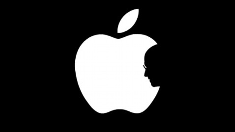
The Apple logo is one of the most identifiable corporate logo in the world. As a huge Apple junkie, I've come to identify with the logo itself. The company did not just draw up an apple and decide to name the company after it. Steve Jobs, at the time, was following one of his crazy fad diets, which happened to be his "fruitarian diet". After spending time driving around after picking apples with Steve Wozinak, an former co-founder of Apple, Jobs decided that the company would be called "Apple Computers". He thought the name was "fun, spirited and non-intimidating".
The first Apple logo (pictured above), The Newton Crest was only in print for one year, 1976. It shows Newton sitting under an apple tree, when he discovered the laws of gravity. This was a greatly detailed portrait that was used as the logo. A logo is suppose to be easily identifiable, and although it says it's for Apple Computers, without the words, it is just a picture. Also, without color, it made the image seem bland and not very exciting.
The end of 1976 called for a new and updated logo for Apple. They decided to make the logo much more modern and bright in color. The Rainbow Apple logo is possibly the most recognizable Apple logo throughout the years. Many people wonder why there is a bite taken out of the Apple. This was strategically placed here to show that the logo was in fact an apple, not a tomato. It also helped to play into the geeky side of the company. The simple play on words, bite and byte. Also, Jobs thought that adding the colors would give the company a more human image. Although we may try to read into the colors, they were not placed in any special order. But Steve did insist that green be at the top for the leaf.
This logo was a transforming move for Apple. They were able to easier brand themselves and their products. As for the consumer, the color and sleek shape catches our eye. The colors also make the logo much most exciting and vibrant, which in turn, related to their products. The lack of font makes logo even more powerful. The Rainbow Apple logo was in effect from 1976-1998.
In 1997, Apple Computers was in the process of becoming the massive organization that we know them as today. Steve Jobs took this opportunity to reinvent the Apple logo to better market and brand their products. The Monochromatic Apple logo was the answer. Jobs wanted to put larger logos on his products but knew that the Rainbow Apple logo wouldn't look very good. At this time, Apple Computers was producing the bright colored iMac G3, which was beginning to fill school districts all over the country. Older Apple computers were beige and included a little Rainbow Apple logo, which looked nice. To keep the logo on the computers, he decided that he needed a simpler, more sleek logo. Another positive outcome of the changing of the logo was that he was able to increase the size, so that it was even more visible and identifiable.
The Monochromatic Apple logo is by far the best logo that they have produced so far. By taking out the color, the logo takes on a more serious aspect, almost business like. Unlike the previous apple, this one is not playful, but it still has an inviting sense. The logo is also much more sleek. This sleekness can be related to their products and operating systems. Apple's operating systems are smooth and very easy to use, which the logo translates.
Apple has done a very good job of branding their company. Although it seems strange to have a simple fruit representing a global technological company, Steve Jobs and his team made it work. The simple portrayal of the apple creates a welcoming atmosphere. Not only is it simple for people to use, it is also something that everyone can associate with, a piece of fruit. It is also very fun that their logo is also similar to the look of their computers, iPods and even their stores. Apple has simplified their logo enough to be relatable to a larger audience. The logo communicates the company well, and still embodies their orignal idea behind the naming of the company, "to be fun, spirited and non-intimidating".


